A Look At Hal Heiner for Governor’s Campaign Website
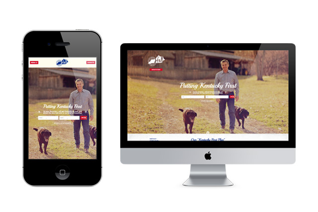
Hal Heiner and his campaign are top a top notch organization, putting a Frankfort outsider and proven job creator into top contention for the Bluegrass state’s governor’s mansion. As the race for the Republican primary enters it’s final weeks, we wanted to share the website that SRG built for their campaign. The site has several features that not only showcase our passion for developing dynamic campaign tools, but also our team’s unique attention to the style and brand of a candidate.
1. Mobile-Friendly Development
For several weeks we’ve been stressing “Mobile-Friendliness” as a critical measurement of a website’s functionality and usability. In addition to mobile-friendliness now being an important metric in Google’s search rankings – it’s also the way the world is moving. In 2015, 11% of the time voters spend with media is on mobile devices. In addition, mobile conversion rates have jumped up to 5% over the past year on devices like tablets. With more and more people using mobile devices to search for candidates, sign-up for newsletters, and make contributions, mobile-friendliness shouldn’t be on every campaign managers checklist when acquiring a new website. Hal Heiner’s site was built with “responsive” mobile technology, meaning users, regardless of the device they’re using, receive a similar, responsively scaled experience.
2. Dynamic Grassroots Tools
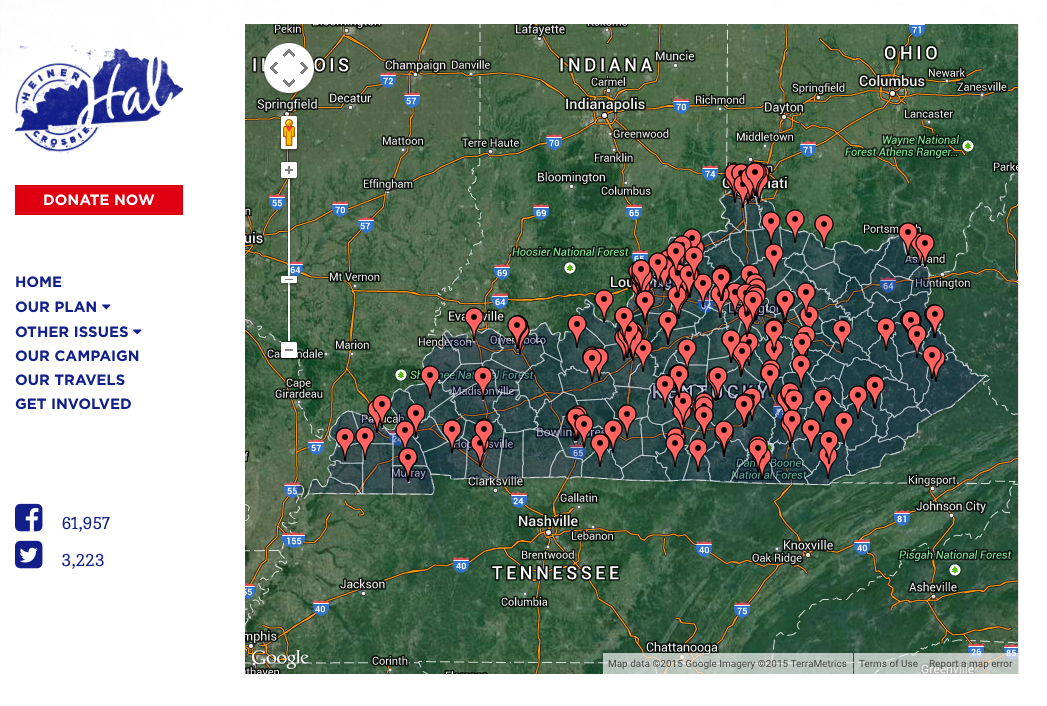
Early on in his campaign, Hal Heiner made a commitment to run a grassroots campaign across every corner of Kentucky. In addition to a robust volunteer sign-up portal, Hal’s website features an app that allows the campaign to showcase it’s travels and events in real time, cataloguing Hal’s travels, along with photos and descriptions of each day’s events. It’s a very cool application.
3. A Brand That Accentuates A Message
Everyone who meets Hal knows that he’s a special candidate. His warmth and good nature permeate every aspect of his outlook for Kentucky and his campaign’s message. He’s the type of conservative that SRG loves working with. In building his campaign website, we also undertook the job of giving his campaign’s branding a look and feel that matched the candidate. Warm colors and fonts, with “Istagramy” photos and a retro-logo set this website apart and give it the unique feel that we want all of our clients to experience.


